The Shell design team was split into 5 different sub-teams, each taking ownership for a part of the app. To make sure all our designs were consistent we were designing with a help of pattern library, that included color & typography styles and different UI components. Nevertheless, this does not mean that the development team followed our way of working, which resulted in several inconsistencies and different implementations of the same component.
Our existing Sketch library or as we call it " Shell UI kit " included all the components and style tokens, but lacked more thorough documentation of the use of different elements.
With Shell app starting from scratch with new re-strategy, it was a perfect moment to fix this problem and implement a fully functioning design system. We decided to start building our own design system on top of Google’s Material design foundation.
The core of the design system requires focusing on native iOS and Android components.
Why exactly Material design?
With Material theming, introduced on Google’s I/O 2018, you can build and customize your own design system, based on pre-determined guidelines and principles. We decided to build upon Material design and also customize it for our needs. This way we could save some time and effort by quickly customizing and using some of the already pre-built components. We were also building upon some of the design and motion principles.
We all own it
There is no “I” in the team and the beauty of the design system is getting everyone involved. Everybody should be able to contribute to the design system to help it evolve and grow to fit with different needs and scenarios.
BUT with having a lot of different people involved, the situation can quite quickly become messy - so it’s important to assign ownership and determine processes.
Choose your tools
There are tons of different tools for creating, managing and maintaining the design system. It was crucial to select the tools that fit our needs and requirements.
We looked at many different designs, design versioning and documentation tools. Each had some pros and cons. Our main criterias were that it needs to be simple and well implemented in our workflow.
Most of the documentation and tools focus on the web and react design systems - as our app was built natively for iOS and Android, the selection was a bit harder.
Our software stack: Sketch for design, Abstract for design version control, JIRA for Issue tracking, Confluence for documentation and Bitbucket as a code repository. Using more tools from the same family is very beneficial as they can be well integrated together. This way we could connect issue number and status to our confluence page.
It is important to choose tools that integrate well with your workflow and everyone is familiar with. We decided to use Sketch as our design tool, backed up with Abstract for version control. As we are using Atlassian’s suite it was only obvious to use JIRA as an issue and project tracking tool, Bitbucket as our code repository and Confluence as a documentation tool.
Workflow
Having a suitable workflow enabled everyone to contribute efficiently and ensured transparency to all team members. In collaboration with the engineering team and project management, we have concluded a workflow for creating new, as well as for updating old design system items.
Everyone can suggest a new component or change to an existing one. When design system issue is created it is put in Backlog of suggestion.
Design system team reviews a backlog of suggestion and decides if a request is valid (if all the information needed is in the ticket) and if any component or change is needed. The component is then either moved into backlog or scrapped.
In sprint planning, we prioritize issues and decide which ones will be finished in the following sprint.
In design review team (development, design and Shell PO) we review any possible issues. We check for: brand implementation, clear documentation and guidelines and Sketch symbol structure.
If the issue passes design review, it is put into development backlog called “Ready for development”.
In sprint planning of the development team, the issues are prioritized and estimated in their backlog. Each issue gets a separate subtask for iOS and Android implementation.
Final review of code, QA of functionality and visual QA. Because we cannot emulate the components on the web, we have created demo apps for iOS and Android, that act as catalog and are used for visual QA.
After the long journey, a new component is finally implemented into the design system and is ready to be used.
With a lot of moving parts (new and updated components), we also needed a strong and clear versioning system. We decided to adopt Semantic Versioning.
Nerdy design stuff
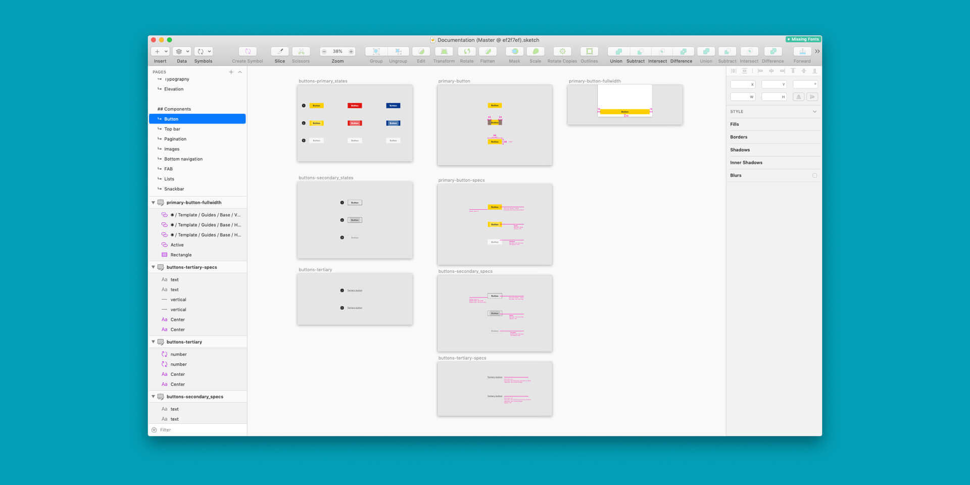
Finally having a design system, was a big step forward for our team, but we were always searching for ways to improve, so we examined on how to better structure our components in Sketch and how to ensure that spacings will be consistent across all our designs.
Documentation includes: Getting started guide (which plugins and fonts to install, how to work with Abstract and Sketch libraries), Foundations (colors, typography, elevation ...), Components (Single components or components made out of other components - e.g. modal windows) and Patterns (there are full-screen reusable components - e.g. tutorial screen).
Each component has a head with name, link to Material documentation (if the component was modified from Material), Version number and link to JIRA issue with status, then followed by the description of component, behavior and specifications.
All design and behavior specifications are documented on Confluence.
For adding components into our designs in Sketch, we have decided to use Stickers plugin that adds a visual representation of all components in the design system with a short description on how to use it and a link to full documentation.
Final thoughts
Design system cannot survive without good collaboration and involvement of everyone in the team. Having clear roles and assignments ensures consistent output.